
Colour temperature and CRI: how to choose the right light
Two numbers on the specification sheet decide how a space feels and how colours look: the colour temperature and the colour rendering.
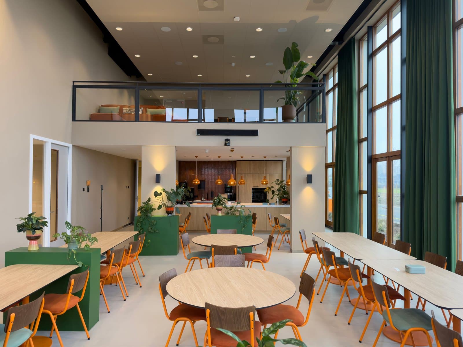
Two values determine how light is experienced: the colour temperature and the colour rendering index (CRI). They appear on every specification sheet, but are often overlooked.
Colour temperature in Kelvin
Colour temperature indicates how warm or cool the light appears. 2700 to 3000 K is warm white and suits hospitality, homes and healthcare spaces where calm is wanted. 4000 K is neutral white, a popular standard for offices and schools. From 5000 K we speak of cool white: energetic, but it can quickly feel clinical.
What does CRI tell you?
CRI runs from 0 to 100 and shows how faithfully colours are rendered compared to daylight. For offices, Ra 80 or higher is common. Where colour really matters, such as in museums, shops or spaces with skin tones, you choose a higher value, Ra 90 or more.
The right combination
Colour temperature and CRI work together. Warm white light with a high CRI feels cosy and shows colours honestly, while neutral white with a high CRI provides clear, reliable task lighting. So it is not about which value is highest, but which suits the space and the task.
Tailored advice
At Atomis we are happy to think along about the right light colour and colour rendering for your project. That way you do not just pick a luminaire, but exactly the light that fits the space. Feel free to get in touch.
9 november 2026